SHAP beeswarm: drivers of CO₂ emissions per capita

How development and energy choices shape CO₂ emissions

The analysis asks a deliberately blunt question: how do income, human development and energy systems jointly drive territorial CO₂ emissions per capita across the world?

Using 1995–2021 data for 204 countries, the work constructs an end-to-end, fully reproducible ML pipeline that links climate outcomes to development trajectories: from UNDP and World Bank indicators, through regression models, to SHAP-based explanations and an AI-assisted indicator search.

The project is engineered to behave like a compact policy analytics unit: global coverage, transparent methodology, and outputs that non-technical decision-makers can still reason with.

View project on GitHub

The problem

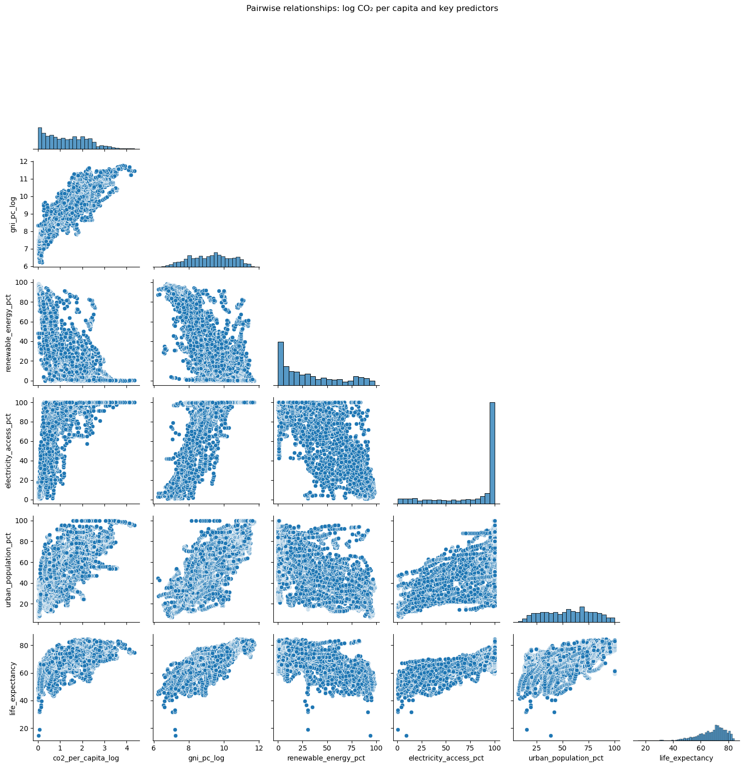
Governments, multilaterals and investors are expected to raise human development while simultaneously reducing emissions. In practice, those agendas are often monitored on separate dashboards rather than as a single system.

Without a structured view of how income, health, education, electricity access, renewables and urbanisation interact, climate policy frequently collapses into slogans and partial evidence.

The result is a real risk of expensive decarbonisation plans that ignore social realities, or development strategies that quietly lock in high-carbon pathways for decades.

📊

The analysis

Data from UNDP, the World Bank and Our World in Data are combined into a country–year panel (1995–2021), and a time-aware modelling pipeline is constructed: 1995–2012 for training, 2013–2021 as an out-of-sample test period.

The core modelling setup compares a linear regression baseline with a Random Forest model predicting log CO₂ emissions per capita from development and energy features.

SHAP is then used to open the model and quantify which levers move emissions, and in which direction, across the global panel.

The solution

The outcome is a global emissions explainer: a model that not only predicts which countries emit more, but also decomposes those emissions into contributions from income, health, education, electricity access, renewables and demography.

On top of the model, a compact semantic search tool and indicator graph allow analysts to discover relevant metrics via natural-language queries and thematic groupings.

The stack – clean data, interpretable ML and AI-assisted exploration – is designed to be directly usable by both technical teams and policy leaders.

Data & Pipeline – Technical Architecture

The dataset is a cross-country panel where each row is a country–year with CO₂ emissions per capita, human development indicators and energy system variables.

The pipeline goes from dispersed global datasets to a single, model-ready panel, and then to explainable predictions and semantic tools: raw CSVs → harmonised panel → ML model → SHAP → semantic search & graph.

1

Data assembly & harmonisation

  • Sources: UNDP, World Bank, Our World in Data.
  • Scope: 204 countries, 1995–2021.
  • Harmonised ISO codes, removal of aggregates (“World”, “High income”), and aligned time coverage across all sources.

Heterogeneous CSVs → single, tidy country–year table.

2

Model dataset & feature set

  • Outcome: co2_per_capita_log = log(1 + co2_per_capita).
  • Predictors: income, education, life expectancy, child mortality, electricity access, renewable share, urbanisation, population growth.
  • Short gaps are interpolated where defensible, rows with missing outcome or features are dropped, and a compact modelling DataFrame is produced.

Clean panel → model-ready feature matrix.

3

Models, SHAP & semantic tools

  • Train/test split: 1995–2012 vs 2013–2021.
  • Models: linear regression & Random Forest.
  • Explainability via SHAP, plus a sentence-transformer semantic search index and a NetworkX indicator graph.

Panel → models → explainable, searchable insights.

End-to-End Pipeline (step-by-step)

📥

1. Ingest global datasets

UNDP, World Bank and OWID CSVs are loaded into pandas. Column names are standardised, country codes are fixed, and basic statistics, ranges and missing values are checked.

Output: a set of clean DataFrames, one per source.

🧩

2. Build the country–year panel

Sources are joined on [country, year], aggregates are removed, and coverage is restricted to 1995–2021 where data are sufficient. Short gaps are interpolated within country.

Output: a harmonised panel of 204 countries × 27 years.

🧮

3. Engineer features

Log transforms are applied to emissions, income and child mortality (co2_per_capita_log, gni_pc_log, under5_mortality_log), and an interpretable set of development and energy indicators is retained.

Output: a concise feature matrix for modelling.

⏱️

4. Time-aware split & baselines

The dataset is split chronologically: 1995–2012 as training, 2013–2021 as test, mimicking a forecasting setup. A linear regression baseline is fitted and evaluated.

Output: baseline performance and sanity checks.

🤖

5. Random Forest & evaluation

A Random Forest regressor is trained on the same feature set and evaluated on the test window with R² and MSE. The model reaches R² ≈ 0.89 on log CO₂ per capita.

Output: a high-performing but still explainable model.

🧠

6. SHAP & country–year explanations

SHAP values are computed for the Random Forest, yielding both global feature importance and local contributions for each country–year. Summary plots and tables are exported to figures/.

Output: auditable explanations for each prediction.

🔍

7. Semantic search & indicator graph

A semantic index is built over indicator metadata using all-MiniLM-L6-v2 embeddings, together with a small NetworkX graph linking indicators to themes such as “Emissions & energy” and “Human development”.

Output: an AI-assisted navigation layer over the indicator space.

Model & Insights

The modelling strategy is intentionally compact: one outcome, a transparent linear baseline, and one non-linear model. The aim is to decode a global emissions system in a way that remains inspectable, rather than to optimise for leaderboard performance.

The workflow moves from understanding the geometry of the data (pairplots), through baseline vs Random Forest comparison, and finally to SHAP-based explanations that provide both global driver rankings and country–year level narratives.

1. The geometry of development & emissions

Pairplot of key model variables: log CO₂, income, education, health and energy indicators

What the pairplot reveals

  • Construction: after building the harmonised country–year panel, a clean modelling subset is selected and a pairplot_modeldata.png is generated for log CO₂ per capita, income, education, health and key energy indicators.
  • Structure: the pairplot highlights the strong, non-linear coupling between income and emissions, tight relationships between development indicators (education, life expectancy, child mortality), and the positioning of energy access and renewables within that space.
  • Implication for modelling: the geometry makes clear that a purely linear specification is a coarse approximation: relevant structure lives in thresholds and interactions that require a non-linear model.
  • Takeaway: CO₂ per capita occupies a structured manifold with income and development, rather than behaving as an independent outcome.

2. Linear vs Random Forest – comparative performance

Model performance comparison: Linear Regression vs Random Forest, with R² and MSE on the test set

Baseline and non-linear benchmark

  • Setup: a time-aware split is used – 1995–2012 as train, 2013–2021 as test – with a linear regression baseline and a Random Forest regressor fitted on identical features.
  • Scorecard: the comparison table summarises test performance: the Random Forest outperforms the linear model, reaching R² ≈ 0.89 on log CO₂ per capita with substantially lower MSE.
  • Interpretation: the performance uplift reflects non-linear relationships and interactions between development and energy variables that a linear model cannot capture, even with careful feature engineering.
  • Design choice: the linear model remains valuable as a transparent reference; the Random Forest serves as the high-fidelity model whose behaviour is subsequently interpreted via SHAP.

3. SHAP beeswarm – global model behaviour

SHAP beeswarm summarising feature contributions for all country–year observations

How development levers move emissions

  • Computation: SHAP values are calculated for the Random Forest over the full test window, producing a beeswarm plot where each point is a country–year and each row is the contribution distribution for one feature.
  • How to read it: horizontal spread encodes impact magnitude, colour encodes feature value (e.g. low vs high income), and vertical density shows how frequently a feature meaningfully shifts the prediction.
  • Key patterns:
    • gni_pc_log dominates; higher income systematically pushes emissions upward.
    • High renewable_energy_pct creates strong downward contributions, visibly bending the emissions curve.
    • Electricity access and urbanisation tend to increase emissions, particularly in tandem with rising income.
  • Interpretation: the beeswarm encodes the joint empirical effect of development and energy choices on emissions across nearly three decades, rather than a single-country case study.

4. SHAP global importance – ranking the levers

SHAP bar plot summarising mean absolute contribution by feature

From intuition to an ordered playbook

  • Computation: for each feature, the mean absolute SHAP value is computed across all observations. These values define the bar heights in shap_summary_bar.png, yielding a global ranking of influence.
  • Hierarchy:
    • Income (gni_pc_log) appears as the primary driver of higher emissions per capita.
    • renewable_energy_pct and electricity access follow, emphasising the energy system configuration as the main counterweight to development-driven emissions.
    • Human development indicators (education, life expectancy, child mortality) and urbanisation form the next tier: important, but secondary relative to income and energy mix.
  • Policy reading: the ranking yields a short, ordered list of levers: income trajectories, renewable deployment and electricity access dominate the emissions profile, with other development metrics shaping the residual variation.
  • Meta-level use: compressing three decades of cross-country data into this hierarchy shifts the conversation from “many indicators” to “these are the levers that matter most, in this data, in this order.”

Reflection & Extensions

The project illustrates one way to handle large, UN-scale questions using modern data tooling: clear framing, disciplined data work, interpretable models and communication that stays close to what the data can legitimately support.

What the work demonstrates

  • End-to-end ownership of the full pipeline: sourcing multi-agency data, designing the modelling strategy, and presenting results for decision-makers.
  • Explainability is treated as a design constraint: SHAP, semantic search and the indicator graph are integrated from the outset rather than added post hoc.
  • The analysis operates at the intersection of machine learning, policy analysis and data storytelling, without compromising technical detail.

Potential extensions

  • Enrich the panel with sectoral structure and technology variables (industry mix, fuel composition, efficiency indicators).
  • Explore panel or sequence models to represent transition dynamics more explicitly over time.
  • Develop scenario tooling that allows users to stress-test different development and energy pathways and inspect the implied emissions trajectories.